
Employer branding at TAURON Group
A large corporation with more than 11 sub-brands wants to unify their image through a single logo for the entire group. We show our version of a case study inside the company on how to effectively introduce the rules from the brand book in the administration, marketing or HR departments and connect it to recruitment.
Main goals
First of all, we assume that most office employees do not know what the brand book is and that pink is the main brand color.
Distribution channels
Workshop
Painting pictures only with brand colors, pencil crayons and sketchbooks, and typography training can’t be boring even for the finance department.
Campaign inside the company
Action practical education
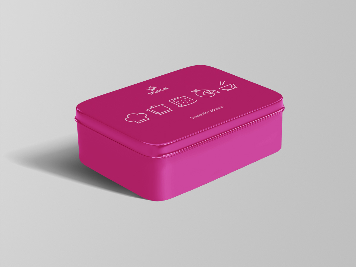
In the kitchen there were cups with specific colors of the company and each employee got a lunch box, on which there were drawn instructions for describing stories through icons. Creating stories while eating is one of the more enjoyable things to do, that’s why we created clear messages that show off the potential of keeping up the company’s good name.
As part of this campaign, we designed:
- Cups - design and production
- Lunch boxes with instructions "how to deliciously build a story"
- "Design-friendly" posters
- Pens and company pencils



Who doesn't love office materials!
As part of this campaign:
- Onboarding notebooks (designs and production)
- Writing accessories (pencils, paints, pens)
- Games and puzzles design
- Posters with instructions for the workshops
- Creation of the workshop campaign